close
Search
Search
About
Work
Contact
Schools site
Here’s a (very) small selection
of our work.
Branding and website for accountants
Your browser does not support the video tag.
Branding for an independent school
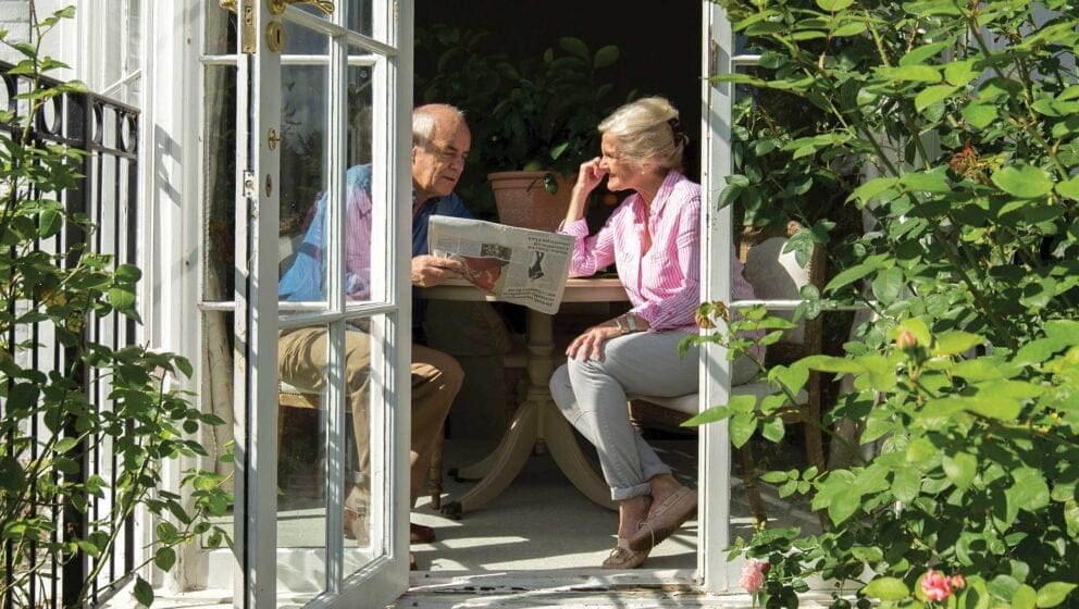
Campaign for retirement housing
Branding for e-learning company
Your browser does not support the video tag.
Branding and website for a genomics provider
Branding and website for a school group